Dental Clinic Website Redesign
UI/UX Case Study

1. Introduction

This project focuses on redesigning the Dental Smiles Clinic website to improve usability, visual clarity, and patient experience. The goal was to create a modern, easy-to-navigate desktop website that helps users quickly find treatment information, book appointments, and feel confident about the clinic’s services.

2. Problem Statement

The existing website for “Dental Smiles” has an outdated visual design with a lack of user engagement features. Due to the poor layout structure and difficulty in navigating the site, this impacts seamless user experience. Patients cannot make an online appointment through the website, which often results in receiving complaints.

3. Design Thinking Process

I’ve used the following design thinking framework to identify real user needs at every decision, from initial empathy research through to final UI design and testing.

4. Empathy Map and User Personas
Empathy Map

This empathy map describes the users’ thoughts, feelings, and behavior when using the existing dental website.

These user personas include the goals and pain points of using the existing website.

  •  

Says

  • I want to book an appointment online.
  • What treatments do they offer?
  • Will they help me to get rid of my dental problem?
  • Is this clinic trustworthy?

Thinks

  • Do they accept online appointments?
  • I’m not sure I trust this clinic based on this outdated site.
  • Do they open the clinic on weekends?
  • Better if they have mention opening hours of the clinic.

Does

  • Click 2-3 other dental clinic sites for comparison.
  • Struggle to find opening hours, contact info and online booking process.
  • Hard to find previous patients’ reviews on the website
  • Looking for the dentists’ bios and the services provide by them.

Feels

  • Frustrated with poor mobile experience.
  • Relief when finding previous patients’ reviews.
  • Uncertain when online booking process is not working properly.
  • Impatient when key information is hard to find.
User Personas
5. Identified Pain Points and Desired Outcomes

Identified User Pain Points

  • Poor usability and navigation.
    • Users struggle to move through sections easily
    • Layout feels unorganized and cluttered


  • Broken/unreliable appointment booking.
  • Lack of trust-building content.
    •  Patient testimonials are hard to find


  • Outdated visual design.

Desired User Outcomes

  • Clear layout with easy navigation sections.
  • A reliable online appointment system.


  • Clear and trustworthy clinic information
    • Services and Dentist details
    • Clinic location and contact informatio
    • Visible patient reviews/testimonials


  • A clean, updated visual design.
    • This also helps to reflect a high-quality, professional clinic
6. Proposed Solution

Redesign the Dental Smiles Clinic website using user-centered design principles to improve usability, build patient trust, and increase appointment bookings.
The solution focuses on:
• A modern, clean visual design aligned with the clinic’s brand identity
• A clear and intuitive navigation structure to help users find information easily
• A simple and user-friendly online appointment booking experience
• A well-structured services section that displays all treatments clearly, with detailed descriptions available for each service

7. User Flows

These user flows depict how a real user moves through the Dental Smiles website to achieve a particular goal.

Include the following main flows:

1)Services discovery flow

2)Appointment booking flow

3)Contact the clinic flow

Services Discovery Flow
Appointment Booking Flow

Key focuses: Appointment confirmation with an email and a text message

Contact the Clinic Flow
8. Wireframes
9. Color Tokens

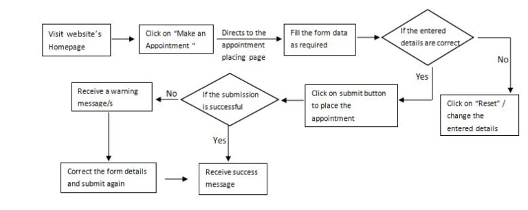
1) Primary brand color → Teal

Used for:

  • Primary buttons

  • Links

  • Key highlights

The system includes a primary teal palette, an orange accent color, greyscale colors (neutral colors), and a set of semantic colors.

To ensure consistency across screens and components, the colors are organized using tokens.

2) Secondary / Accent Color → Orange

3) Neutral Colors → White, black, and greys

4) Semantic Colors → Green, yellow, and red for success, warning, and error

10. Typography

“Roboto” is used as the primary font.

11. Components

Reusable UI components are created to ensure visual consistency, faster design iteration, and a scalable interface.

Key interactive components include hover and focus states to provide visual feedback and improve usability.

12. Design Concerns and Final UI Designs

DESIGN CONCERNS

Note: All data shown is fictional and used solely for design demonstration.

FINAL UI DESIGNS

  • Home Page
  • Online Appointment Booking Page
  • Online Appointment Booking Progress Page

  • Online Appointment Booking Completed Page
  • Online Appointment Booking Success Page
  • All Services Page
  • Single Service Pages

13. Design Insights and Future Steps

Design Insights

Patients value speed and clarity more than visual complexity. Users primarily visit the dental clinic website to quickly find doctor availability, services, and contact options. Reducing visual noise and highlighting key actions like ‘Book Appointment’ significantly improves user confidence and easiness.

Future Steps

Adding available time slots and dentist selection could significantly reduce phone calls and improve patient convenience.