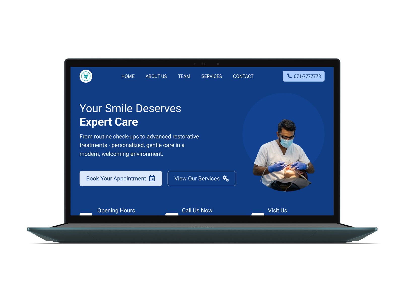
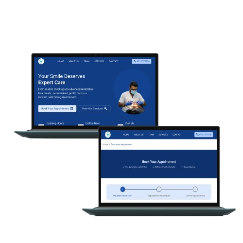
This project focuses on redesigning the “Dental Smiles” clinic website along with online appointment booking to improve usability, visual clarity, and patient experience. The goal was to create a modern, easy-to-navigate website that helps users quickly find treatment information, book appointments, and feel confident about the clinic’s services.
The existing “Dental Smiles” website had an outdated visual design, unclear content structure, and difficult navigation. Patients had limited access to online appointment booking, and therefore, they had to call the clinic, leading to missed calls, booking errors, and patient frustration. They struggled to find important information such as services, clinic details, opening hours, and patient reviews.
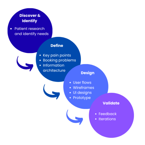
As this project focused on redesigning an existing experience, I used a user-centered process to identify usability issues, understand patient needs, explore solutions, and validate the redesigned experience.
This empathy map describes the users’ thoughts, feelings, and behavior when using the existing dental website.
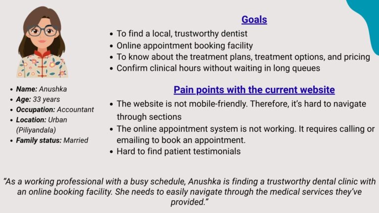
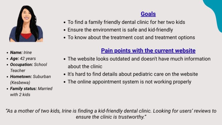
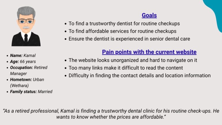
These user personas include the goals and pain points of using the existing website.
Says
Thinks
Does
Feels
Desired User Outcomes
Redesign the Dental Smiles Clinic website to improve usability, build patient trust, and increase appointment bookings.
The solution focuses on:
• A modern, clean visual design aligned with the clinic’s brand identity
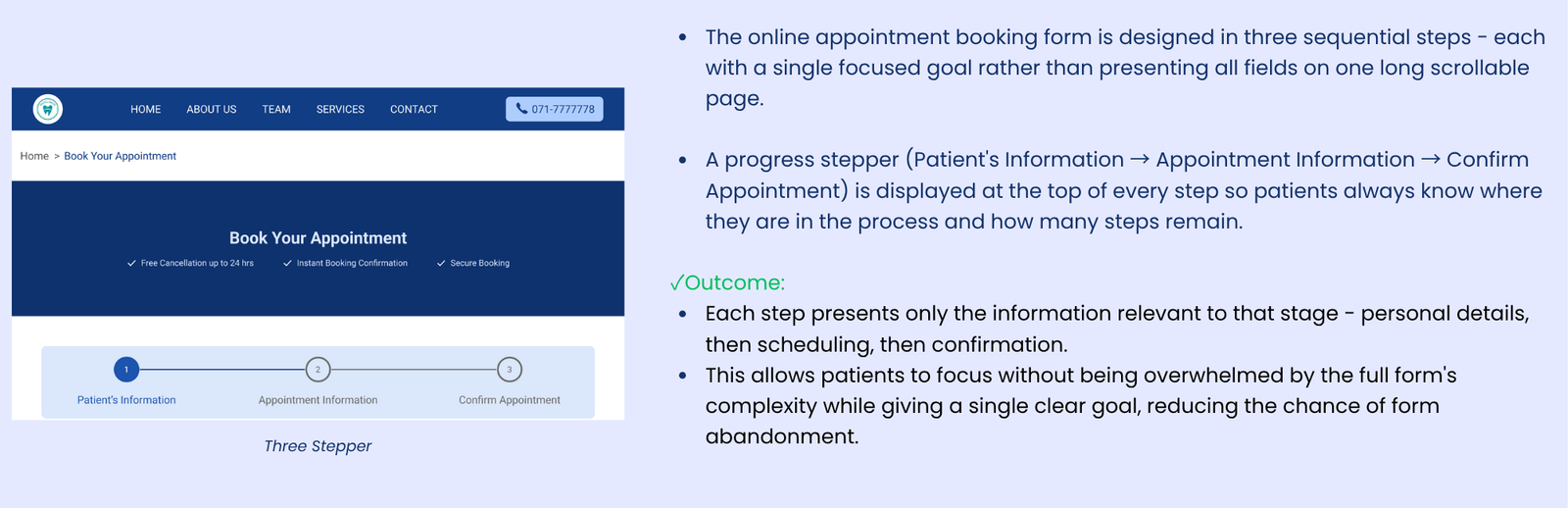
• Introducing a three-step online appointment booking system
• A clear and intuitive navigation structure to help users find information easily
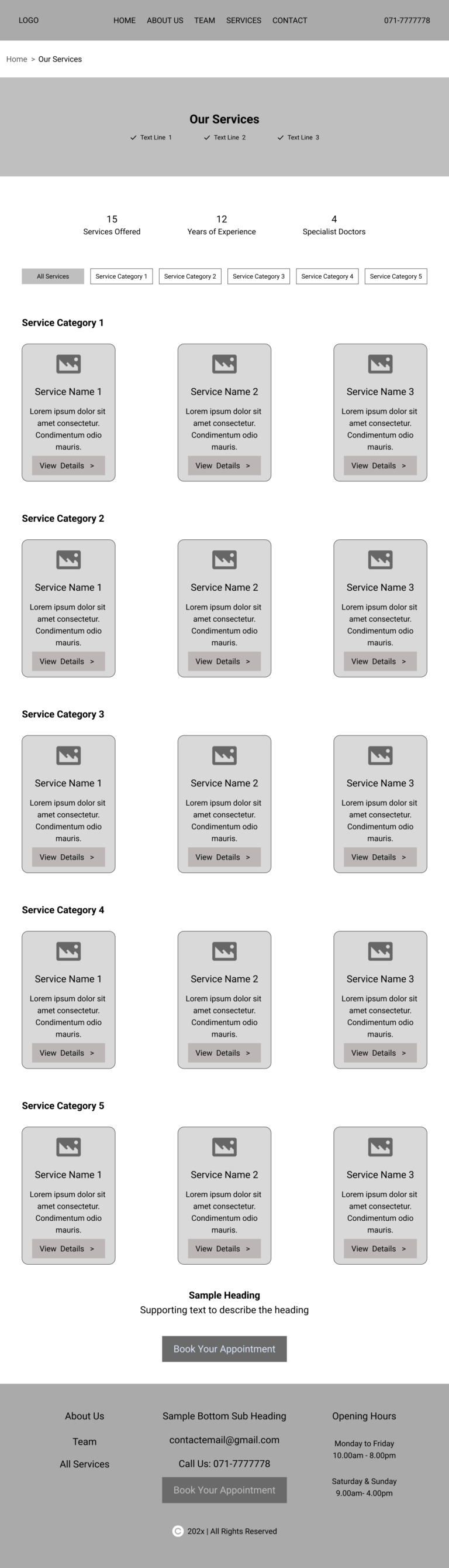
• A well-structured services section that displays all treatments clearly, with detailed descriptions available for each service
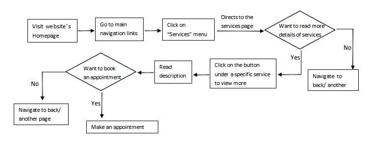
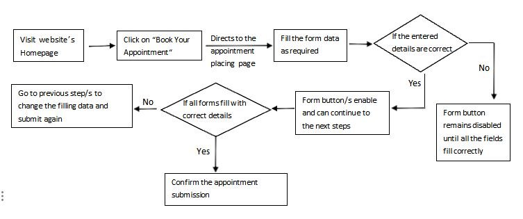
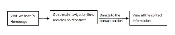
These user flows depict how a real user moves through the Dental Smiles website to achieve a particular goal.
Include the following main flows:
1)Services discovery flow
2)Appointment booking flow
3)Contact the clinic flow
Key focuses: Appointment confirmation with a text message
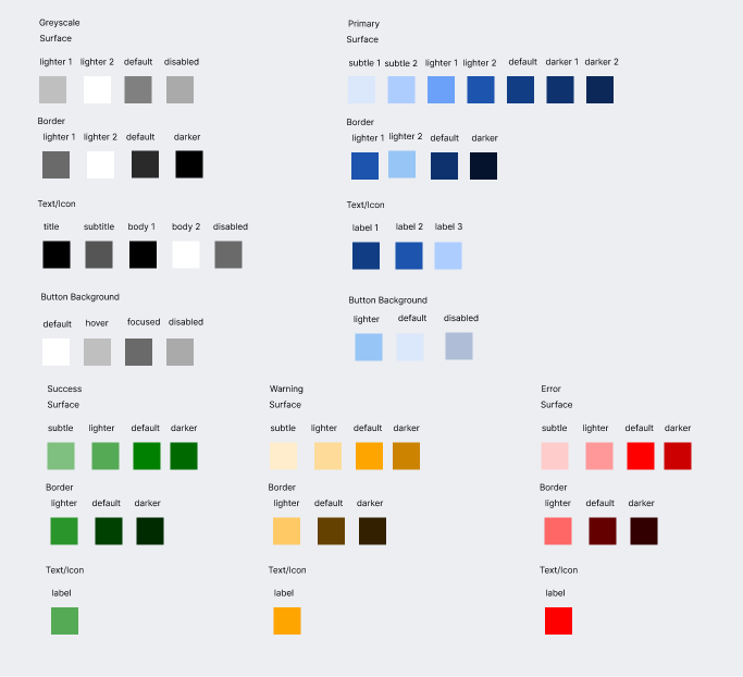
1) Primary Brand Color → Blue
The system includes a primary blue color palette, greyscale colors (neutral colors), and a set of semantic colors.
To ensure consistency across screens and components, the colors are organized using tokens.
2) Neutral Colors → White, Black, and Greys
3) Semantic Colors → Green, Orange, and Red for success, warning, and error
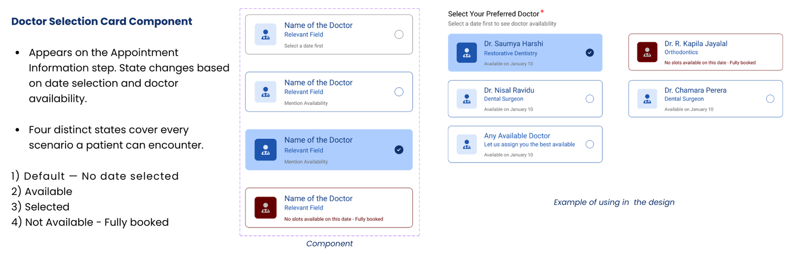
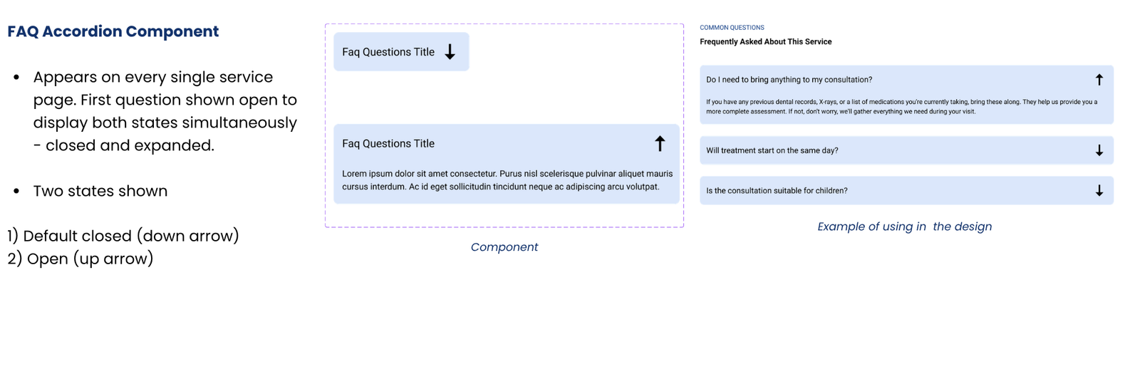
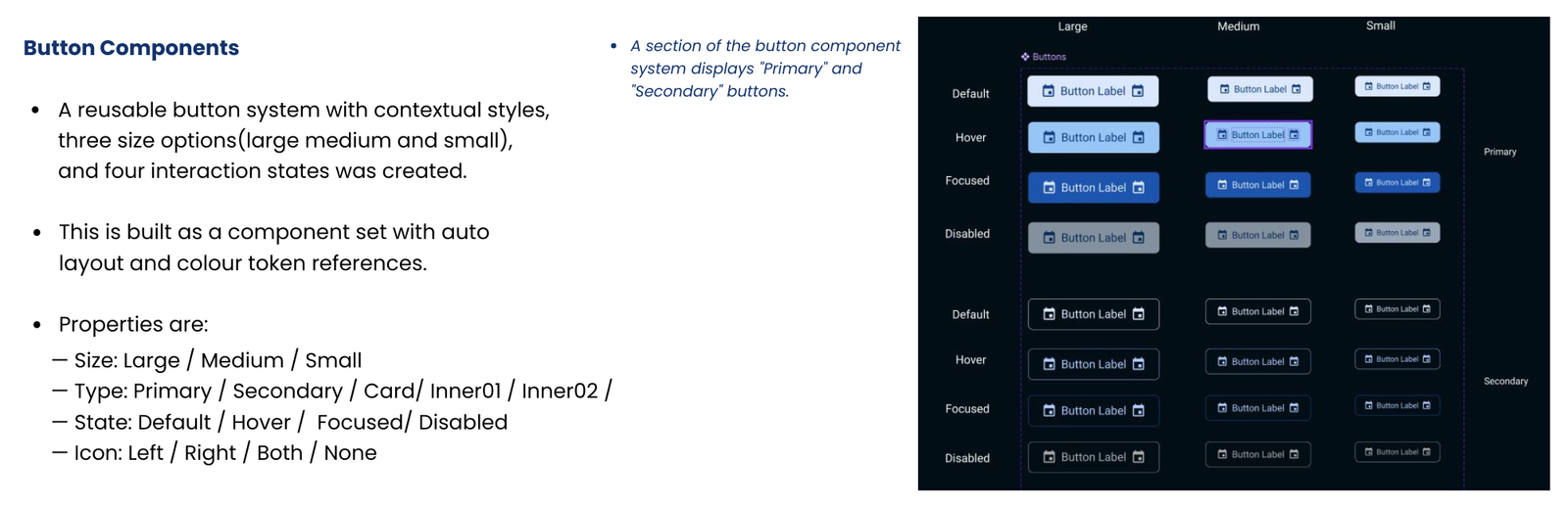
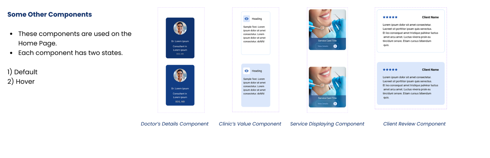
Reusable UI components are created to ensure visual consistency, faster design iteration, and a scalable interface.
A look at the key design decisions and the reasoning behind them.
Key highlights
Patients’ review
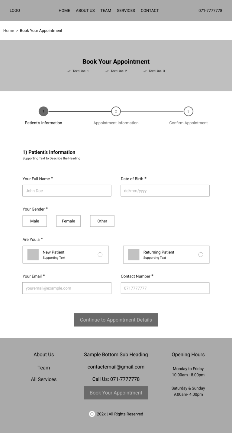
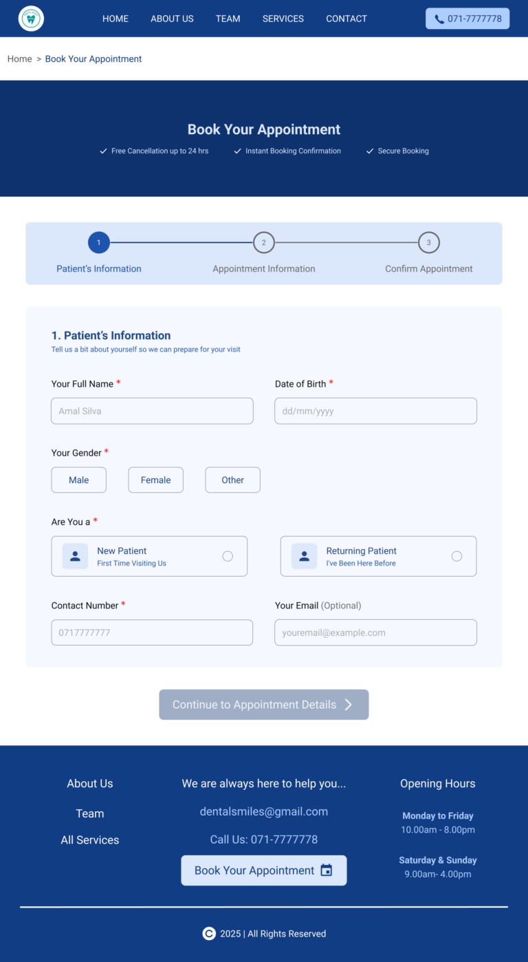
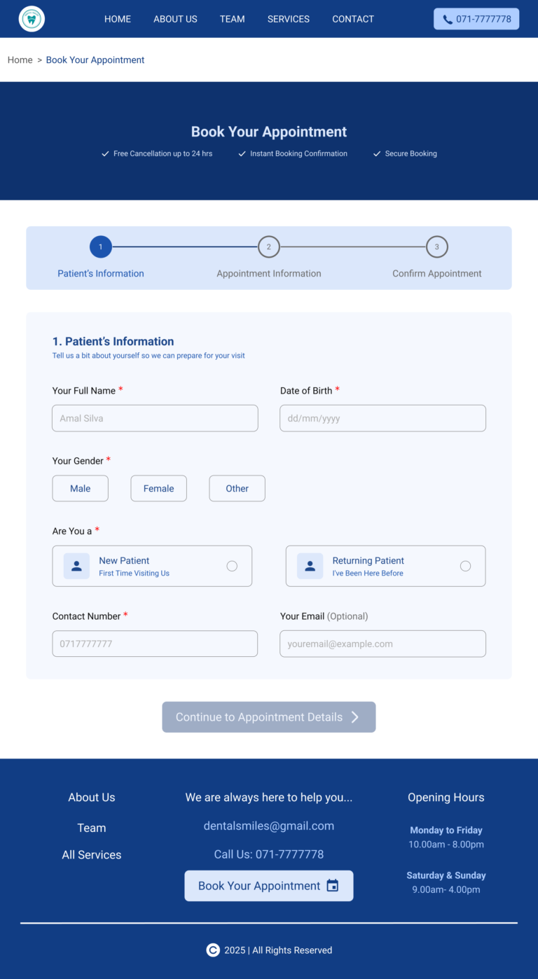
This is the complete view of the “Online Appointment Booking – Patient Information Page” (Blank State).
Key highlights
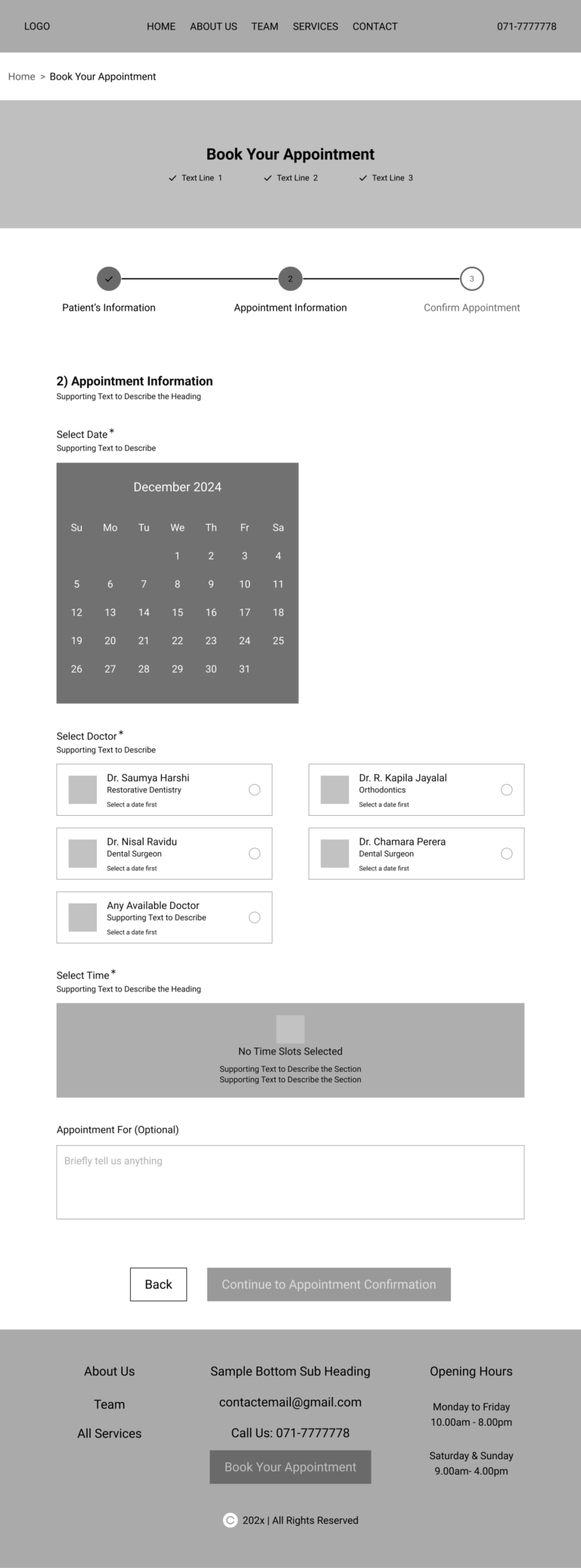
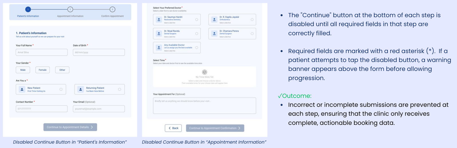
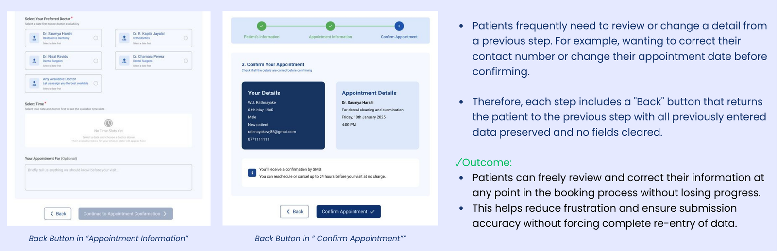
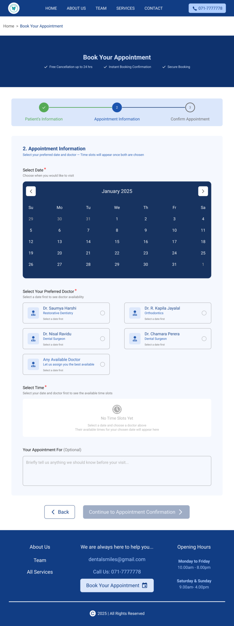
The online appointment booking form is designed in three sequential steps.
First is designed for “Patient’s Information.” The continue button is disabled at this stage.
This is the complete view of the “Online Appointment Booking – Patient Information Page” (Filled State).
Key highlights
The continue button is enabled for correct user inputs.
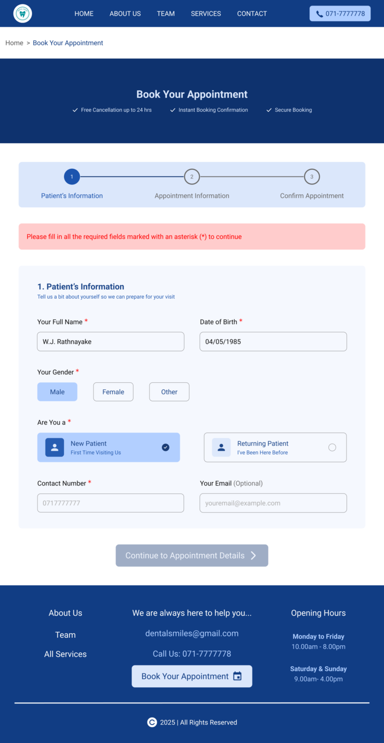
This is the complete view of the “Online Appointment Booking – Patient Information Page” (Warning State with warning banner for validation errors).
Key highlights
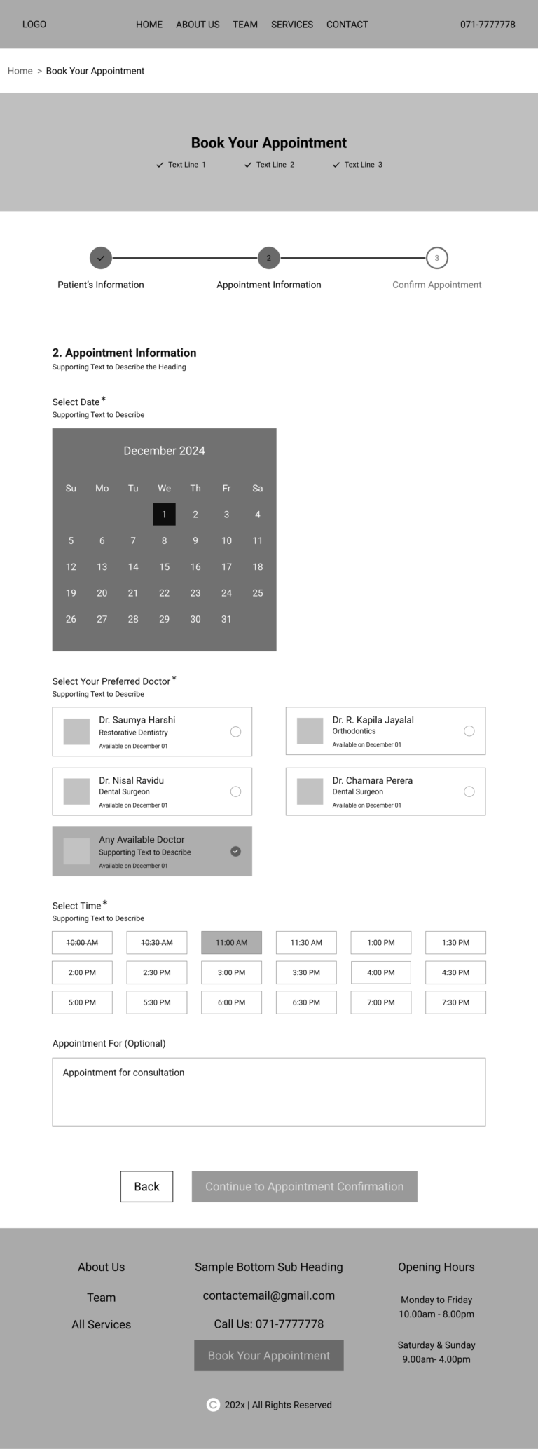
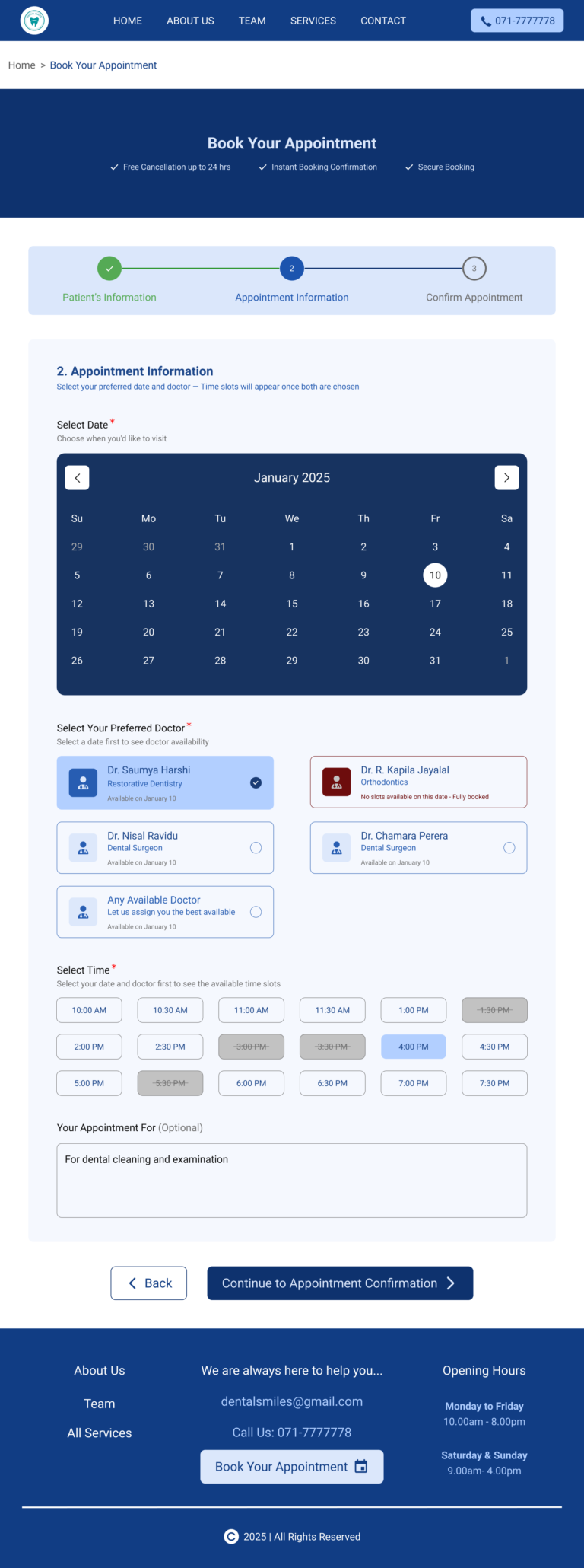
This is the complete view of the “Online Appointment Booking – Appointment Information Page” (Filled State).
Key highlights
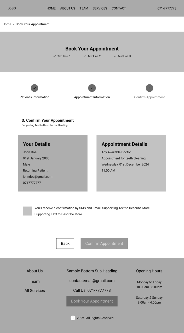
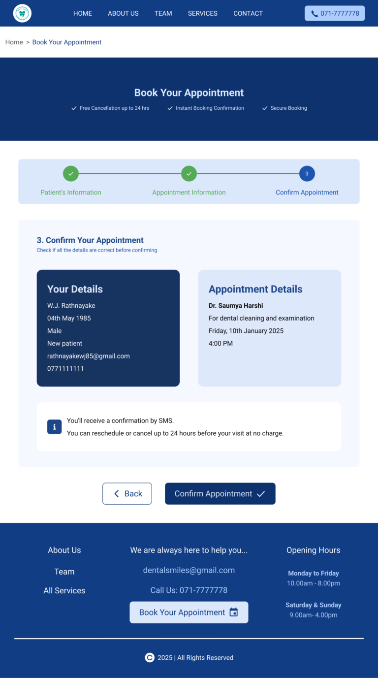
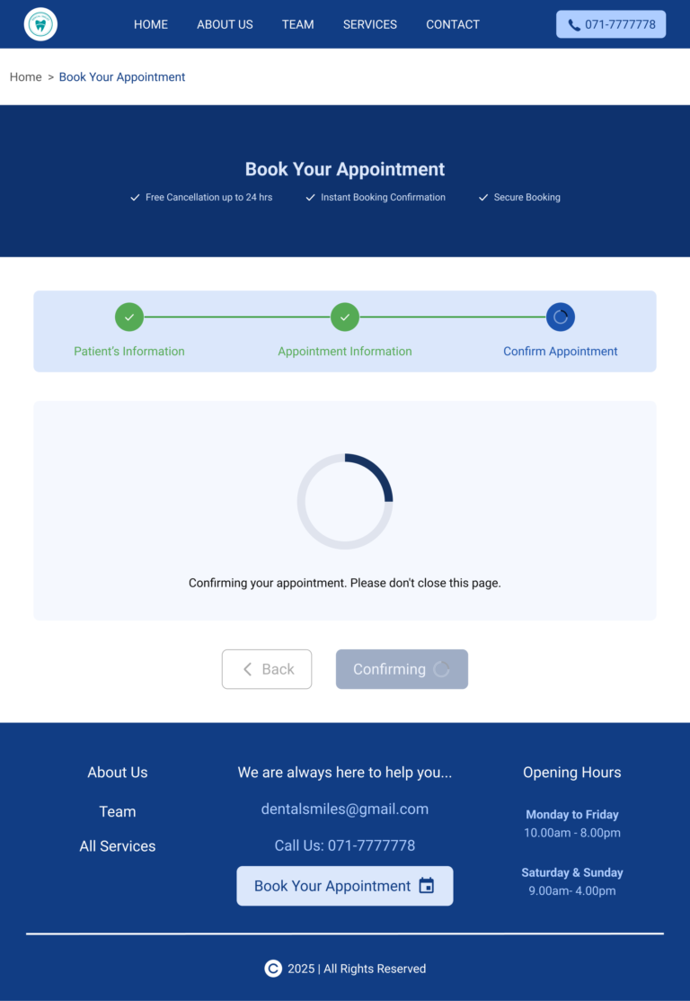
This is the complete view of the “Online Appointment Booking – Confirm Appointment Page”.
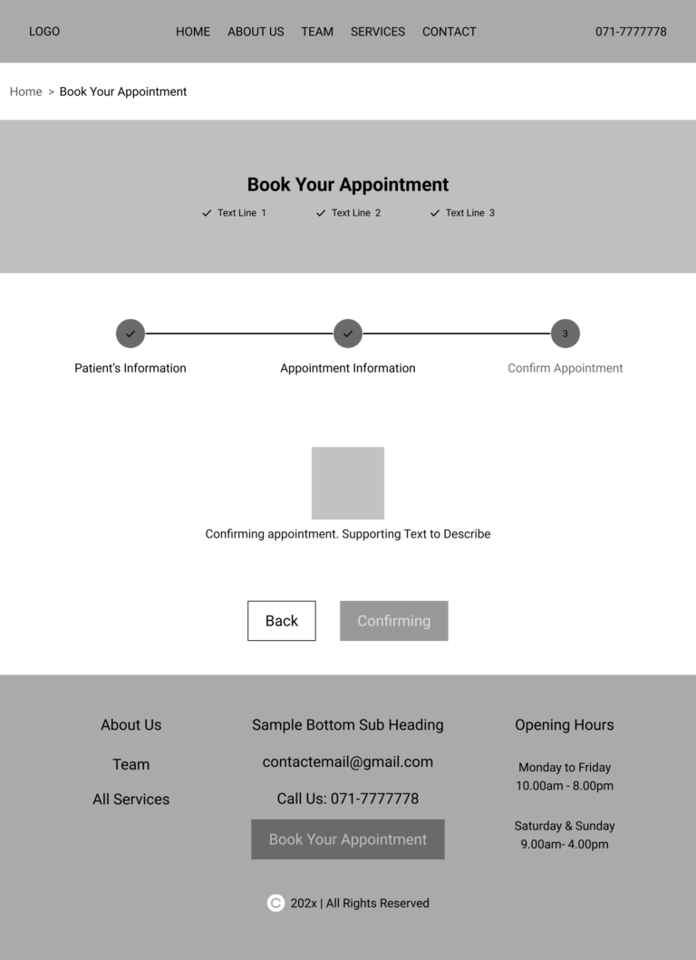
Key highlights
Key highlights
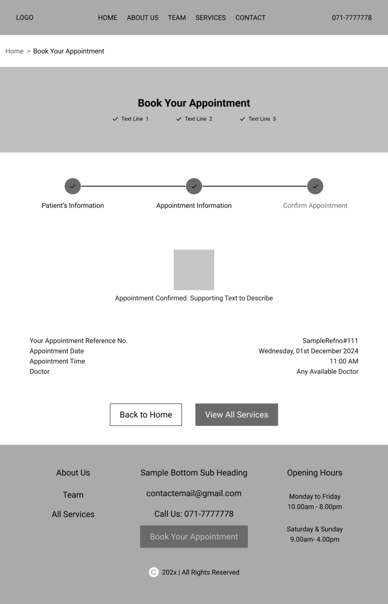
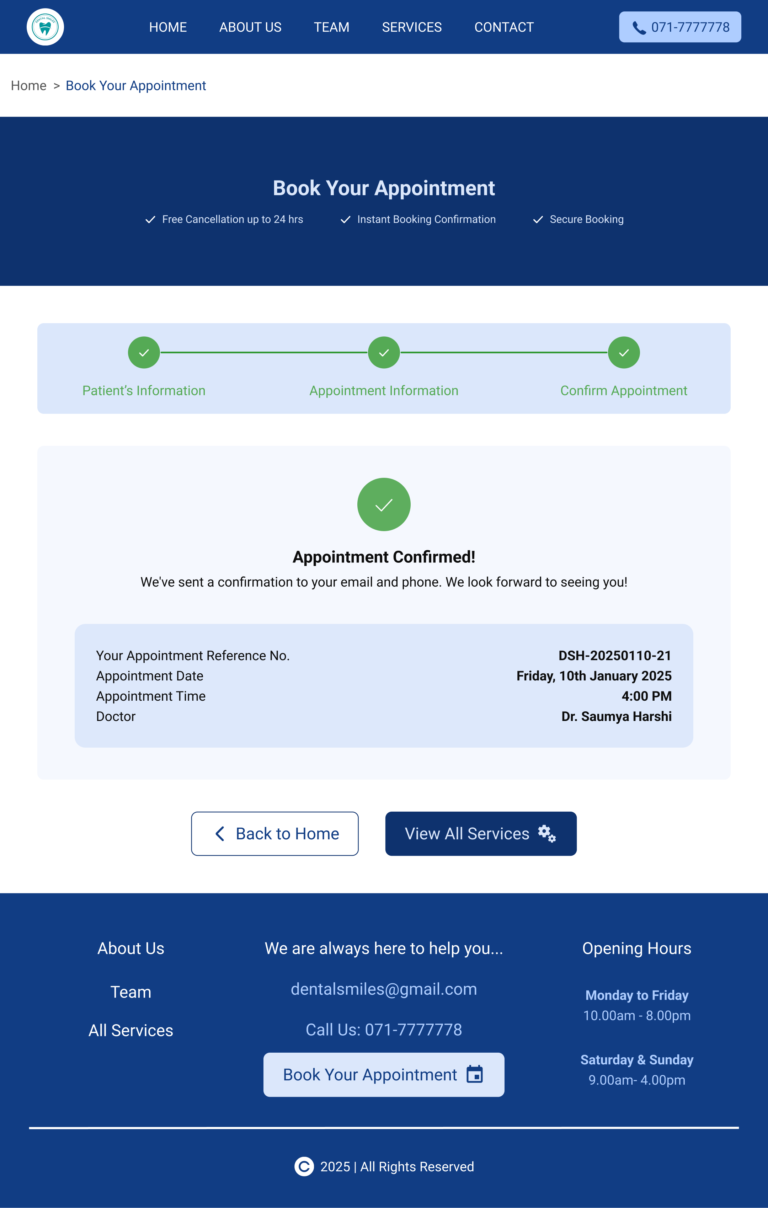
This is the complete view of the “Online Appointment Booking Success Page.”
Key highlights
Booking confirmed – the patient receives a reference number and appointment summary.
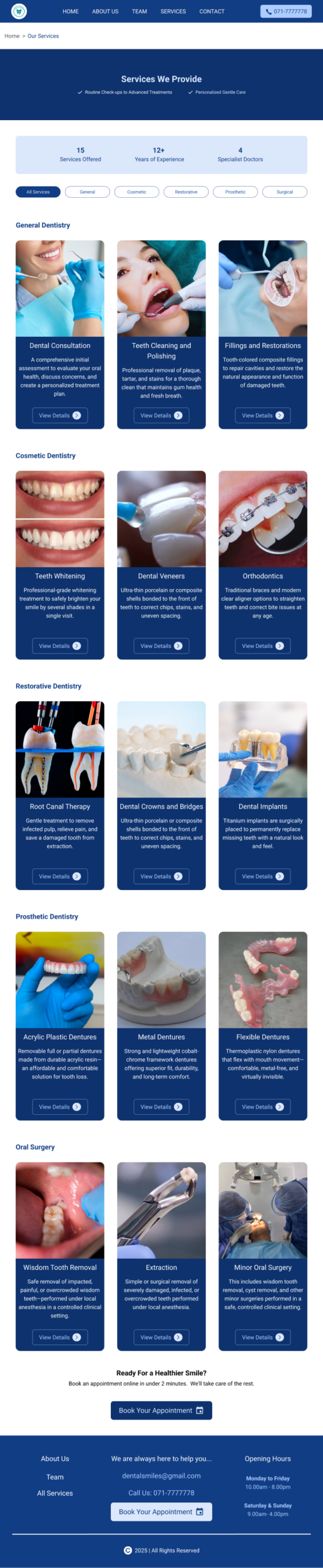
This is the complete view of the “Services We Provide Page.”
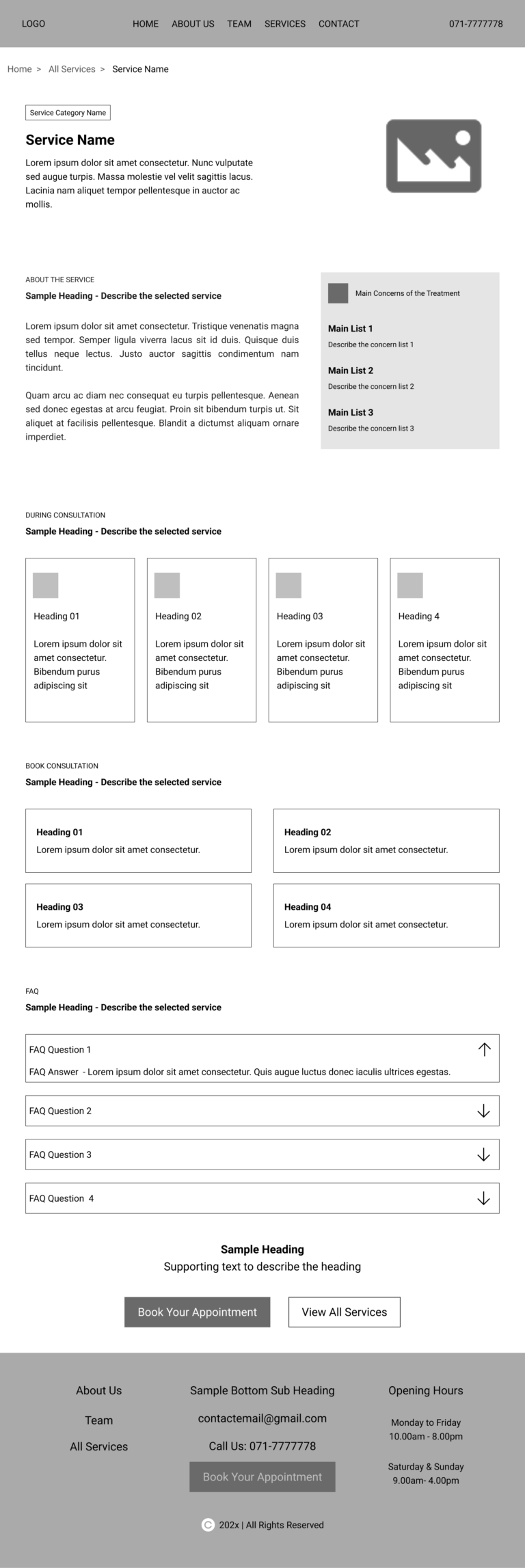
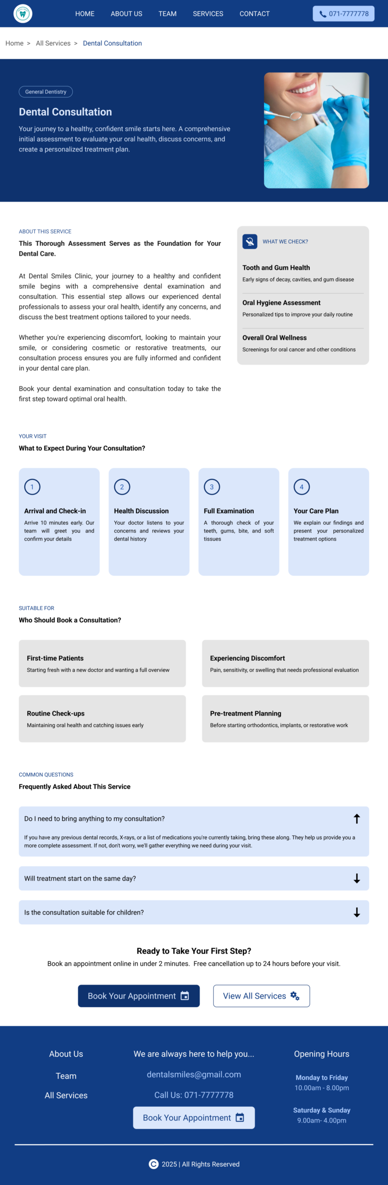
This is the complete view of the “Single Service Page – Template Design.”
Shown here – Dental Consultation Page.
This template is applied across all services across 5 categories.